Spreads


 \
\

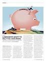
The spreads used in Kiplinger's magazines have very useful information that elaborates in great detail on how to manage and control your magazine while at the same time it shows a very colorful and cartoon type of drawing which further helps reader understand how to manage their finances as well. By constantly changing the picture in each page to something more interesting or entertaining the Kiplinger magazine effectively maintains the attention of the reader and the pictures also serve to in having a way to express topics that are generally boring and makes them suddenly interesting and easy to understand. The Kiplinger magazine has a general style of how the magazine is designed and it all follows the same format. A white page, a large picture, and a sans serif font with the lettering. They all have the main cover line in bold which puts emphasis on that particular issue as well. I will try to have this type of uniformity in my magazine to pay homage to the greatness of kiplinger. All in all the spreads used by kiplinger tend to be simple: white background, large photo (cartoon style or realistic) and a prolific amount of useful of information. The fonts are simple and I would like to change that in my own magazine.


Comments
Post a Comment